The Trinity: 3 Studios Shaping Toronto’s Design Reputation
The Trinity: 3 Studios Shaping Toronto’s Design Reputation
Toronto design has a specific kind of confidence now. Less trend-chasing. More execution. These three studios are not the whole story, but they explain a lot about how the city thinks about hospitality, atmosphere, and modern retail precision.

The city rewards restraint and detail. When it works, it feels inevitable.
Why these three matter
If you want to understand the Toronto aesthetic without reading 200 project pages, start here. Each studio represents a different kind of power: hospitality, atmosphere, and retail-level execution.
This is not a ranking. It is a starter map. The goal is simple: give you a clean way to explore their work and learn how to spot the decisions behind the finished photos. Toronto’s best work tends to look calm, but it is rarely simple. It is the result of a lot of controlled decisions: material, lighting, sightlines, and the discipline to leave certain things alone.
A strong studio has a point of view and the ability to execute it repeatedly, across budgets and constraints.

Look for repeatable choices, not a single heroic image. The best studios have a consistent attitude toward proportion, material honesty, and lighting.
1. DesignAgency
DesignAgency is a reference point for Toronto hospitality. Their work balances narrative and practicality, with spaces that feel lived-in rather than staged. They understand that hotels and restaurants are endurance tests: lighting shifts through the day, finishes get touched, surfaces get judged up close.
What to notice
- Layering: texture and graphic moves without forcing a theme.
- Energy placement: lobby, bar, circulation. The places people actually gather.
- Lighting discipline: contrast, glow, and the way materials read at night.
Start here
Their work on The Drake helped define a certain Toronto hospitality attitude: confident, a little gritty, and curated without feeling sterile. Use it as a reference for how a space can carry identity without relying on loud materials.

2. Mason Studio
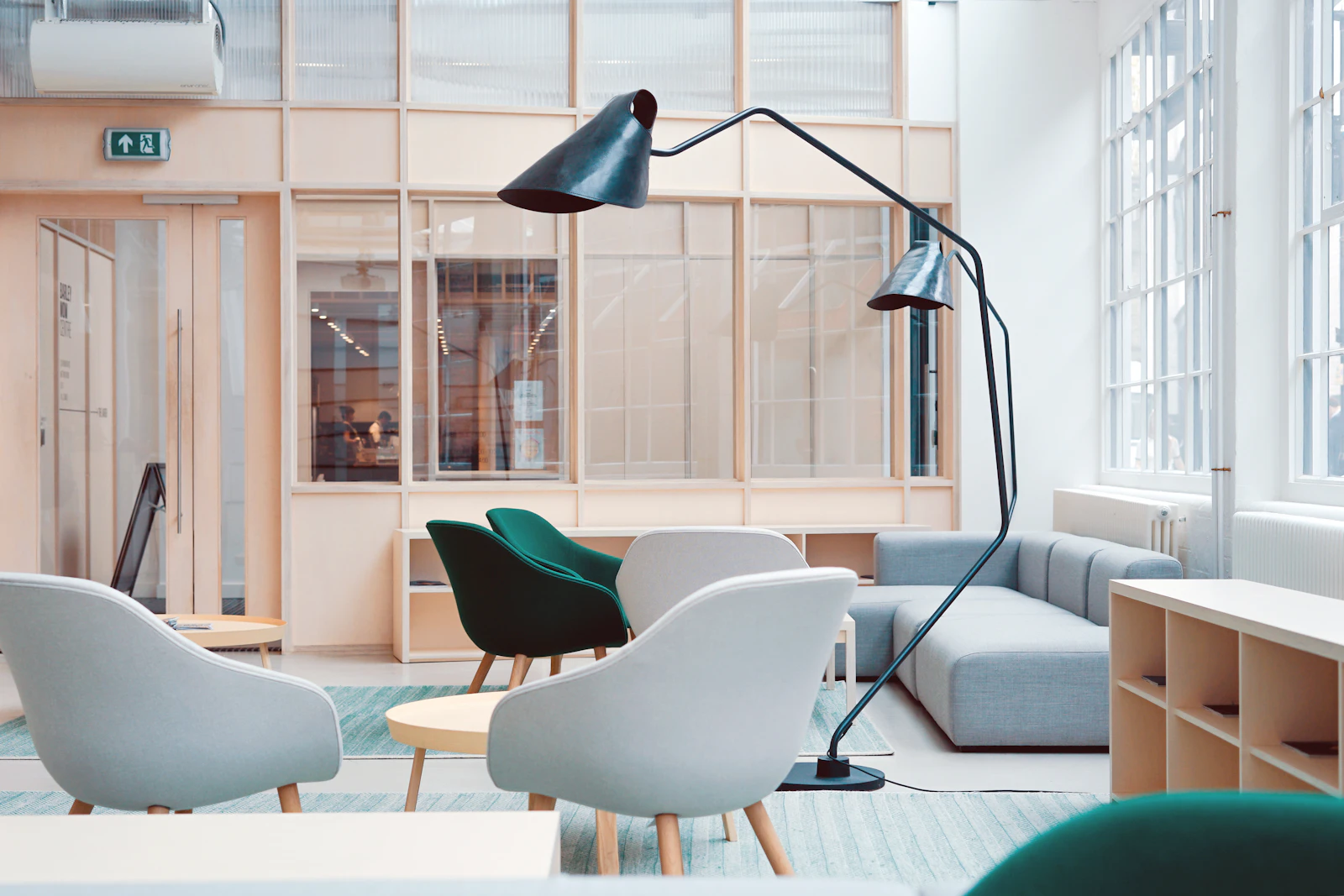
Mason Studio tends to operate on a quieter frequency. Their projects often feel calm, tactile, and intentional. You will see a lot of restraint, but it is not minimalism for minimalism’s sake. It is a focus on how surfaces feel, how light moves, and how a room supports the person inside it.
What to notice
- Material softness: light woods, matte finishes, textiles used as architecture.
- How they treat negative space: what they remove is part of the design.
- Warmth without cliché: tone comes from texture, not “decorative” moves.
Why it matters in Toronto
In a city full of glass boxes, a calm interior reads as luxury. Mason understands that luxury can be quiet and still feel expensive. Their work is a good reference if you are trying to make a new build feel lived-in without clutter.

3. Burdifilek
Burdifilek is best understood through retail. Their work has a gallery-like confidence: strong lines, controlled drama, and a sharp understanding of how people move through space. If you have walked through Holt Renfrew, you already know the energy.
What to notice
- Editing: they let products, light, and geometry create the effect.
- Contrast: polished and matte surfaces placed with intention.
- Circulation: retail as choreography, not just layout.
Why this matters beyond retail
Retail is a high-pressure environment: everything has to read instantly. That discipline translates well into residential projects where the client wants clarity, polish, and a specific mood without excess.

The Toronto tells
Toronto style is not one thing, but the best work here tends to share a few habits. You can spot them once you start looking.
1. Materials that age well
Toronto projects that last lean on surfaces that improve with use: real wood, stone, good metal, and textiles that soften rather than collapse. High gloss can work, but it is rarely the whole story.
2. A strong anchor move
One primary decision carries the room: an oversized light, a built-in wall, a strong material moment, a single art piece, a clear geometry. Everything else supports it.
3. Lighting as architecture
The city’s best interiors treat lighting like structure: layered, intentional, and tuned for evening. If a space only looks good at noon, it is unfinished.
Pull up a project photo and cover the furniture with your hand. If the room still has a clear rhythm and proportion, the architecture is doing its job.
How to use this list
Use this as a starting point when you are planning a renovation, hiring a studio, or trying to understand what kind of work you actually respond to. Don’t look for labels. Look for behaviour.
Make your own short brief
- Pick 3 images you keep returning to.
- Write one sentence about why. Be specific.
- Note what is absent. No pattern, no shine, no colour, no ornament. That matters.
- Then look for studios who do those choices repeatedly.
Want this list to get smarter? Send a studio you think belongs here: info@the416edit.ca.